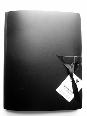
As an illustrator, you portfolio is the most important thing in your arsenal of tools. It showcases your talents to the world and gives potential clients an insight into your working style. Your portfolio must show your pride in your work. It must present your work as luxurious and beautiful, something for art directors to covet. Show your artwork the respect it deserves and other people will be impressed as well.
1. Buy a beautiful portfolio case or binder. My personal favourites are Pratt and Panodia. They are smart, professional, and durable. Your portfolio will land in a pile of other portfolios on an art director's desk, you want it to have presence and weight. To stand out from the others because it is beautifully and professionally presented.
2. Personalize the cover in some way. Many of my friends glued on cards with their name and address. I didn't feel comfortable denaturing the front of my beautiful portfolio. Instead I took a piece of ribbon and tied my business card to the front loop. This way it makes the portfolio look like a gift for the art director.
3. Sleeves: Make sure your plastic sleeves are as transparent and fingerprint free as possible. You want to your artwork to shine.
4. Paper: Don't tape or glue photocopies of your artwork onto the grey or black backing pages of the portfolio. Print your images onto sumptuous heavy rag paper, such as Somerset Velvet, which is lightly textured paper for inkjet printers. The art paper makes the digital print look almost as good as the original, the colours sit on top of the sizing of the paper, rather than soaking in like regular paper. This makes them extra brilliant.
5. Title Page: The title page is the first thing an art director will see. Make sure you have a strong image on that page, as well as your contact details. This will make them curious to find out what is in the rest of the book.

6. Page and Book Design: Make sure your spreads are well designed. Think about the portfolio as a book, not just a collection of images. Start with your strongest images at the front, then include with a few projects you are proud of, then then end with a few strong images again. You have to think of the structure like a sonnet or an essay with an introduction, a body and a conclusion.

7. Number of Images: Most mail-in submissions ask for 8-10 images. However, you can indulge when you get the chance to show your physical portfolio. I suggest having 20-40 images. This is your chance to shine; show your diversity.
8. Can I have more than one image on one page? Yes. But make sure they are paired well so the compliment rather than compete with each other. Make sure you keep a good rhythm: some pages with only one image, some pages with more. This keeps your book interesting.
9. Include some postcards: I always submit my portfolio with a few postcards that the art directors can keep. This helps me to gauge their reaction. If they keep the postcards I know that they were interested.